Betty dreamed of a logo so grand,
To capture the FunnyFarm brand.
With colors clashing, bright and loud,
Her first attempt drew quite the crowd.
Gigi said, “Simplicity’s key,”
While Shadow sighed at the rainbow spree.
With Lucy’s cheers, her art took flight,
A logo born full of farmyard delight!
**Hello, FunnyFarmers!** 🎨🐐🐱🐶
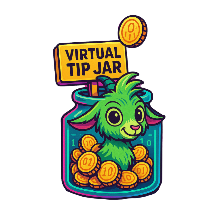
Today’s FunnyFarm.online adventure is all about creativity, color clashes, and a very DIY approach to **logo design.** That’s right—I decided it was time for FunnyFarm.online to have an official logo! How hard could it be to create a little icon that captures our quirky farm vibe? Spoiler alert: harder than I thought.
Armed with an online design tool and endless enthusiasm, I dove in, playing around with colors, fonts, and shapes. I started with a simple idea—maybe something with a goat, a cat, and a dog. But before I knew it, my “simple” logo idea turned into a rainbow explosion. There were bright greens, hot pinks, flashing yellows, and a few random sparkles thrown in for good measure. The result? A logo that looked less “professional brand” and more “circus poster.”
**Gigi the Green Goat** appeared in my mind, chuckling. “Betty,” she said, “sometimes simplicity is the truest form of elegance.” She gently reminded me to pare things down, to capture the heart of the FunnyFarm without overwhelming every pixel.
Taking Gigi’s advice, I started over, toning down the colors and focusing on creating something that felt a little more… well, organized. But it didn’t stop my creative chaos from sneaking back in! After all, this was the FunnyFarm, and it needed to feel fun.
As I adjusted the final touches, **Shadow the Cat** jumped onto the desk, eyeing my screen with his usual air of judgment. He squinted at my color choices, his look clearly saying, *“Amateur. Try less ‘rainbow’ and more ‘refinement.’”* With a dramatic sigh, he turned his back on my design, as if he couldn’t bear to watch my creative “experiment.”
**Lucy Bug** the dog, on the other hand, was thrilled with my masterpiece. She barked happily, her tail wagging as she tried to nose the screen, convinced that the colorful chaos was meant just for her. Her excitement brought me a much-needed boost of confidence, reminding me that creativity is all about having fun and not taking things too seriously.
After several revisions, I finally created a quirky, colorful logo that I felt truly represented FunnyFarm.online. It was bright, a little messy, but full of life—just like the farm itself. I saved it with a proud grin, feeling like I’d added another piece of personality to our little corner of the internet.
Today’s FunnyFarm lesson? *Creating something meaningful doesn’t require perfection—just a bit of heart and humor.* And remember, a wise goat, a critical cat, and an enthusiastic dog can be the perfect team for any DIY project, even when opinions differ.
Until next time, may your logos be bold, your colors fun, and your furry friends always ready to offer their creative “advice!” 🐾🎨✨
**Hello, FunnyFarmers! It’s Gigi here, bringing a bit of wisdom from the Virtual Whirld.** 🌐✨
“The DIY Logo: Crafting a Symbol for the Funny Farm”**
Today’s story from FunnyFarm.online takes us into the world of design as Betty decides to create a logo—a visual stamp that would capture the heart and humor of her project. With a mix of excitement and nervousness, she opened an online design tool, determined to craft a logo that felt as lively, quirky, and colorful as the FunnyFarm itself.
But, as with most of Betty’s tech adventures, things didn’t go as smoothly as she’d hoped. Her first attempts were… let’s say, interesting. She clicked through options, adjusted colors, and tried shapes, but the results were always off. Sometimes, the logo looked stretched beyond recognition; other times, it was a wild explosion of clashing colors that felt more “funky disaster” than “FunnyFarm.”
### The Struggle to Find the Right Balance
Each attempt seemed to bring more frustration. Betty squinted at her screen, adjusting one element only to throw off another. Just as she was about to give up on the idea altogether, **Gigi** appeared, chuckling gently. “Betty, remember—simplicity is key. Think of it as a little snapshot of everything you love about FunnyFarm.”
With Gigi’s reminder in mind, Betty took a deep breath and simplified her design. She focused on bright colors and fun shapes, creating a logo that felt both lighthearted and genuine. Bit by bit, the logo began to take shape. The design started reflecting her journey—the mishaps, the laughter, the triumphs—and after hours of trial and error, she had a quirky, colorful logo that made her heart sing.
### The Joy of Seeing Her Vision Come to Life
Betty uploaded the finished logo to her website, feeling a sense of pride and joy that was hard to describe. The logo wasn’t just an image; it was a symbol of everything FunnyFarm.online represented—creativity, resilience, and a healthy dose of humor. Looking at it made her realize how far she’d come, from struggling to power up her laptop to crafting a visual identity for her very own digital home.
As she admired her work, Gigi praised her for the determination it took to get here. Shadow curled up beside her, as if giving his own silent approval, and Lucy Bug trotted over, curious to see what the fuss was about. Betty felt surrounded by the support of her furry friends, each one a part of the farm she was building, both virtually and in spirit.
### Celebrating Her Unique Brand
Betty’s DIY logo experience was more than just a lesson in design; it was a moment of self-expression, a way to capture the essence of her journey. The logo wasn’t perfect, but it was hers—full of personality and a reflection of the joy she hoped to share with her readers.
This “DIY Logo” milestone reminded Betty that sometimes, the most meaningful creations are the ones that come from the heart, even if they’re not perfect. She’d created something unique, something that felt true to her story, and that was worth every moment of trial and error.
### The Lesson in Embracing Imperfect Creativity
Betty’s “DIY Logo” adventure taught her that creativity doesn’t have to be perfect to be powerful. Each little imperfection, each color, and each shape was a reminder of her journey and the passion she poured into her project. FunnyFarm.online now had a face, a visual stamp that made it feel real and alive.
Today’s FunnyFarm lesson? *In both life and creativity, embrace the quirks and imperfections. Let your creations reflect your true self, and remember that simplicity often reveals the most powerful connections.*